Advanced Typography || Task 01
Advanced Typography
31/8/2022 - 5/10/2022 (Week 1 - 9)
Jonathan Wiguna Halim 0356790
Advanced Typography || Exercise
Instructions
Advanced Typography MIB
Lectures
Lecture 1
Typographic Systems
There are 8 types of major variations with an infinite number of permutations :
- Axial (all elements are organized to the left/right of a single axis "a line" & it doesn't need to be a straight line)
- Radial (all elements are extended from the point of focus)
- Dilatational (all elements expand from a central point in a circular manner, it doesn't need to be just 1 area/point)
- Random (elements appear to have no specific pattern/relationship)
- Grid (a system of vertical & horizontal divisions)
- Modular (a series of non-objective elements that are constructed as a standardized unit, such as using boxes to guide the placement of info)
- Transitional (an informal system of layered banding "curvy line")- Bilateral (all text is arranged symmetrically on a single axis, although more than 2 axes can be used)
- Bilateral - The contrast in color might be too jarring, making it difficult to read.
Lecture 2
Typography Composition
There are 8 different types of typography composition:
1. Emphasis
2. Isolation
3. Repetition
4. Symmetry
5. Asymmetry
6. Alignment
7. Rhythm
8. Contrast
Rule of thirds: The rule of thirds is a straightforward concept where designers divide their designs into three rows and three columns, and the emphasis points should be at the locations where the vertical and horizontal lines intersect.
By using the rule of thirds is a great way to make your design’s composition more organized and easy for people to know the main focus.
Environmental Grid: This system is based on the exploration of the existing structure or numerous structures combined. The designer then organizes the information around this super-structure, which includes non-objective elements to create a unique and exciting mixture of texture and visual stimuli.
Form and Movement: This system is based on the exploration of an existing Grid system. These system development purposes are, for students to explore the multitude of the options the grid offer, to dispel the seriousness surrounding the grid system, and to see the turning of pages in a slowed-down animation in the form that constitutes the placement of image, text, and color
Lecture 3
Context and Creativity
Handwriting: is so important because handwriting would become the basis or standard for form, spacing, and conventions mechanical type would try and mimic it. The shape and line of hand-drawn letterforms are influenced by the tools and materials used to make them.
Hieroglyphics | 2613-2160 B.C.E.
The Egyptian writing system is fused with the art of relief carving. Hieroglyphic images have the potential to be used in 3 different ways: as ideograms, as determination, and as phonograms.
Early Greek | 5th C. B.C.E.
Built on the Egyptian logo-consonantal system, the Phoenicians developed a phonetic alphabet consisting of 22 letters. These early Greek letters were drawn freehand, not constructed with compasses and rule, and they had no serifs.
Roman Uncials
By the 4th century, Roman letters were becoming more rounded, and the curved form allowed for fewer strokes and could be written faster.
English Half uncials | 8th C.
In England, the uncial evolved into a more slanted and condensed Typeform. Writing on the European continent devolved considerably and needed a reformer. Luckily it came in the Carolingian Handwriting Reform.
Emperor Charlemagne | 8 C. CE
After the fall of the Roman Empire, the end of a central advanced culture resulted in general literacy and a breakdown of handwriting into diverse regional styles.
Carolingian Minuscule
The Carolingian minuscule was used for all legal and literary works to unify communication between the various regions of the expanding European empire and also was as important a development as the standard Roman capital.
Black Letter | 12-15 C. CE
Characterized by tight spacing and condensed lettering. Evenly spaced verticals dominated the letterform.
Moveable Type | 11C. - 14 C.
The introduction of moveable type was introduced in the 1000-1100 CE. This innovation was pioneered in China but achieved in Korea (Diamond Sutra).
Programmers and Type Design
More vernacular scripts are being produced by software giants (Google). More vernacular and "multi-script" typefaces - a term coined by Muthu Nedumaran - are being produced to cater to situations where the written matter is communicated in the vernacular script or vernacular and Latin scripts
Lecture 4
Why design another typeface?
- type design carries a social responsibility so one must continue to improve its eligibility
- type design is a form of artistic expression
Adrian Frutiger
- He is a renowned twentieth-century Swiss graphic designer
- His valued contribution to typography includes Univers and Frutiger typefaces
- Frutiger is a sans-serif typeface and was designed in 1968 specifically for the newly built Charles de Gaulle International Airport in France
-The goal of this new typeface was to create a clean, distinctive and legible typeface that is easy to see from both close-up and far away.
Verdana
- The font was tuned to be extremely legible even at very small sizes on the screen due in part to the popularity of the internet and electronic devices
-exhibit characteristics derived from the pixel rather than the pen, the brush, or the chisel.
Johnston Sans
- A creator hugely influential London "Underground" typeface
- He was asked to create a typeface with "bold simplicity" that was truly modern yet rooted in tradition and he completed it in 1916 combining classical Roman proportions with humanist warmth.
Process of Type Design:
-Research
- To understand type history, anatomy, conventions, and also to know termonologies side-bearing, metrics, hinting
- To determine the type's purpose or what it would be used for
- To examine existing fonts that are presently being used for inspiration/idea/context
- Sketching
- Some designers sketch it using traditional tools such as brushes or pens and then scan them for the purpose of digitalization
- Some designers prefer to sketch it using digital tools such as Wacom directly into font design software, but this can sometimes impede the natural movement of hand strokes
- Digitization
- Make the font that the designer already make using traditional tools into digital by using professional software: FontLab and Glyphs App
- Testing
- Testing is part of the process of refining and correcting aspects of the typeface.
- Prototyping is also part of the testing process and leads to important feedback
- Deploy
- Even after deploying a completed typeface, there will still be a revision, there are always teething problems that did not come to the fore during the prototyping and testing phases.
Lecture 5
Perception & Organisation
Perception is the way in which something is regarded, understood, or interpreted. In typography deals with the visual navigation and interpretation of the reader via contrast, form, and organization of the content.
How does contrast work?
1. Light/Bold, Condensed/Extended, Organic/Machined, Roman/Italic, Small/Large, Negative/Positive, Serif/Sans-Serif, Ornate/Simple, Red/Blue
2. Contrast / Size
Provides a point to which the reader's attention is drawn.
3. Contrast / Weight
Describes how bold type can stand out in the middle of the lighter type of the same style
4. Contrast / Form
The distinction between a capital letter and its lowercase equivalent, or a roman letter and its italic variant, a condensed and expanded version of the typeface.
5. Contrast / Structure
The different letterforms of different kinds of typefaces, ex: a monoline sans serif and a traditional serif, or an italic and a blackletter.
6. Contrast / Texture
the method is to put together all of the above and apply them to a block of text on a page, you come to the contrast of texture
7. Contrast / Direction
is the opposition between vertical and horizontal, and the angles in between. Turning one word on its side can have a dramatic effect on a layout.
8. Contrast / Color
The use of color is suggested that a second color is often less emphatic in values than plain black on white. Therefore it is important to give thought to which element needs to be emphasized and to pay attention to the tonal values of the colors that are used.
Organisation / Gestalt
Gestalt means the way a thing has been "placed" or "put together" in german words. Gestalt psychology is an attempt to understand the laws behind the ability to acquire and maintain meaningful perceptions
Practical
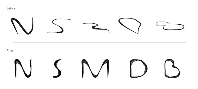
After I do a refinement, I try to put a grey between the two lines gap. I get these features from the water breaks reflection.


.png)


Comments
Post a Comment