Advanced Typography || Task 03
Advanced Typography
26/10/2022 - 23/11/2022 (Week 9 - 13)
Jonathan Wiguna Halim 0356790
Advanced Typography || Exercise
Instructions
Lecture
-
Practical
Week 07
Mr. Vinod briefs us about task 3 which is to make our own font that people never make before.
Week 09
From the brief before, I got a total of 7 ideas. 3 of it is redesigning game titles, 1 is completing a K-pop album cover, and the last 3 are experimental font. At first, I am thinking to make the puzzle font.
Fig 1 Proposal Slides
However when I came back home, and try to sketch out the puzzle font based on my findings on a puzzle. It turns out ugly and the outcome will be very ugly. Because when it gets typed it cannot be in 1 line, it will become like stairs. Although I already have thought to make this font into a puzzle for kids, where later on I implemented AR into it, so kids can learn words.
Fig 2 First Sketches
From there I observe its characteristic of it and. Here is what I found: There is a gap between each segment where it can be snapped into other pieces, and there are no sharp edges, all of it got rounded corners.
Fig 4 - First Draft
Here I really do an experiment on how to make all of the letters have the same characteristic and consistency. One thing that I want is that there is no separate graphics in whichever letter I have. For example, I do not want to have a dot on top of my lowercase 'i'. And that becomes my problem because I do not how to differentiate it from my lowercase 'l'. So I make this attempt where I connect the dot of the "i" with its body and doesn't look good.
Fig 5 - lowercase "i" and "l"
And when I search online on how do lowercase letter "l" looks like I found out that "l" doesn't always have a straight line like the uppercase "i", it can have a small line feature at the end of the line.
Fig 6 - lowercase "l" references
And here are my second attempt at making the letter "l" and "i". And I like the outcome of it. So now I still maintain my key feature where I don't want any of my letters to have a separation.
Fig 7 - lowercase "i" and "l" refined
Other than the letters "i" and "l". I also have a problem with the letter 'E' which we can see on the left letter, it feels really boring, it is just an ordinary letter E without any characteristics. However then I change the angle of the gap and make it slanted towards the middle part of the "E", and I find it really nice because it looks like the brain flakes.
Fig 8 - Uppercase letter "E", left (before), right (refined)
Fig 9 - Variation of letter "Q"
And the one that I choose is the number three. Why did I take off the other two? The reason for it is 1st the one doesn't really look like the letter "Q" so much, and the 2nd one is just because there is no other letter that has a tail like that, and if I choose that it will make my font not consistent.
Week 10
Here I try to make the letter "f" smaller so there is a difference between uppercase and lowercase, but then I forgot to change the other lowercase letter which lead to another problem, where my letter "f" looks really small compared to other lowercase letters.
- Not attend
Week 11
This week our class conducts online. And by week 11 this is my progress on the font. I have finished the uppercase and also lowercase.
Fig 10.1 - Uppercase finished
Fig 10.2 - Lowercase finished
The feedback that I got is that, it is good, and has a good consistency. The one thing that is a problem is where it can be applied. It can be applied to the game packaging itself though. And other feedback is only I need to fast finish the numbering and also punctuation. So I can start putting it into FontLab to test it out and adjust the kerning.
So on week 12, I put my letter on FontLab and try to do kernings. I watched a youtube video on how to do it. And they guide me to do classes and open up "Pair & Phrases" to make my kerning method easier. So I did it, and it was really a tough job to do kerning for my letter. At first, I thought it will be easy because my letter is just a box.
Fig 11 - Problem 1 (letter j)
So here is my first problem, when I do the kerning, I found out that my lowercase "j" tail is beyond the baseline and that is why when it pairs with other letters that do not have a tail, I will have a problem with the kernings. So I do another version of the lowercase "j" by shortening the tail of it.
Fig 11.2 - Problem 1 solved (letter j)
So now the second problem is the letter "f". When I import it, I did not pay attention to the TopLine of each letter, which is why I get this problem where the uppercase and the lowercase are almost the same.
Fig 12 - Problem 2 (letter f)
Fig 12.2 - Problem 2 solving(letter f)
Fig 12.3 - Problem 2 solving (letter f)
So what I did is just make the letter "f" slightly bigger and this is the result and I am satisfied with the proportion of it.
There are two problems when I copy the font from AI to the font lab which are the size difference and also I do not pay attention to the baseline for letters "q" and "p". From this I learned that I need to pay more attention to other letters which have the same features.
Fig 13 - Problem 3 (lowercase)
Fig 14 - Problem 4 (baseline)
I am really struggling with using FontLab, at first I thought that it will be simple because all my letter has the same form and shape in terms of size. And I thought that it would be very easy. Until I found this book written by Indonesian people talking about the font. There is a thing called sidebearing that I do not notice while using FontLab.
Fig 15 - Sidebearing
Then later on I add the side bearing left and right 22pt, so when added to other letters becomes 44. I am doing this because when I measure the gap inside the font is also 44. Then from there, I identify if there is any letterform that needs kerning for a specific letter. And I found these.
Fig 16 - Problems
Thankfully after I saw the video and also read the book talking about sidebearing, it really help me and make my progression faster than before.
Fig 17 - Final Outcome
Applications
After doing the font, we need to apply this font to something that is suitable. And because this font was inspired by a toy called BrainFlakes. So I will use it to redesign the brand. First I look up which mockup is suitable for a toy box. And then I found this.
Fig 18 - BoxMockup
When I pick this, I already have in my mind, I would like to do two styles of a box design, one is light and the other is dark. However it is really plain, there are no toys or anything else that may help people understand the product.
Fig 18.2 - BrainFlakes MockupUp
Fig 19 - Blender Process
From there I render the flakes only without the boxes. And then I combine it with my previous mockup with some adjustments to match the lighting and also added the cast shadows.
Fig 20 - Final Mockup 1
For the 2nd application. I am going to make an Instagram ad post. And I got the inspiration from this LEGO ads poster. And I would like to replicate the background.
Fig 21 - LEGO ads Poster
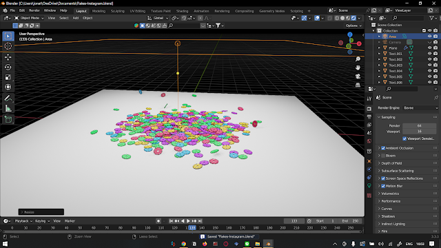
So, I go back to my Blender3D to make a bunch of BrainFlakes and then drop it into a plan to replicate the image above.
Fig 22 - Blender3D flakes
Fig 23 - Flakes Rendered Image
From that picture, I make the Instagram ads also with the shop button in it. And here how it looks like.
Fig 24 - Final mockup 2
For the last mockup, I choose to redesign their landing page. Because I already make a new design for the box packaging, then I need a brand landing page that showcases it.
Fig 25 - Website (before)
What I change basically is the logo and also change the landing page image into showcasing the new box packaging.
Fig 26 - Final mockup 3
You can download the font from here
Feedbacks
Week 9
GENERAL FEEDBACK
The decision is up to me
SPECIFIC FEEDBACK
The "Little Atro" and "Treasure Island" fonts are already good enough no need to refine them. You can do an experiment on the mist.
Week 10
Not Attend
Week 11
General Feedback
All have good consistency, keep up!
Specific Feedback
Make it into puzzle pieces, then what? There is no purpose of it
You can use this as the mockup for this kind of game but it is not really nice.
Week 12
General Feedback
Need to expedite the application because only 1 week left
Specific Feedback
-When making the kid's toy packaging, it doesn't have to have a lot of graphics on it
- other applications maybe an Instagram or Facebook post to promote these toys to the parents
Week 13
No feedback this week
No feedback this week
Reflections
Experience
I get the experience to make my own font, it is quite fun and also hard at the same time. I experience a lot of struggle actually when doing kerning. It is really hard because this is my first time making my own font.
Observation
I observe so many fonts that have unique features so it is really distinctive from other fonts. And from that observation, I can implement it into my fonts.
Findings
I found that making a font, it's process is really long, and in that long journey, I find some articles and also videos on how people teach to do different ways to do kerning.
Further Readings
So this book is talking about what is font and all features that we need to pay attention to when making a font.
What did I get from this book?
When I read this book, it helps me to understand my own font. And I also know about sidebearing after I read this book which helps me to do my kerning faster.


.png)


Comments
Post a Comment