Advanced Typography || Task 02
Advanced Typography
31/8/2022 - 5/10/2022 (Week 7 - 11)
Jonathan Wiguna Halim 0356790
Advanced Typography || Exercise
Instructions
Lecture
-
Practical
Task 02 part A | Key Artwork
Fig 1.1 1st draft attempt
So here are my first attempt at making my own logo. What I am trying to make here is my initial which is either JO / JOE. Personally, I really like the top left or the bottom one. Why do I like the first one? Because it looks exactly like me, where it got my glasses. And the bottom one is because I feel like it looks cool.
Fig 1.2 Final decision
And here is the animated logo video. What I do in here is quite simple just make an animation of the line that looks like it gets drawn, but I add another line behind with different colors to make the animation not look so boring.
Task 02 part B | Collateral
Fig 2.1 Book Mockup
Here is the first mockup that I make, because the brief said that I need to put my picture in one of the posts. So here it is, myself on a book cover where at the back of my face there is a line that I get from my logo components. And I add one more mockup which is a sticker that you can see at the bottom right corner with my logo on it.
Fig 2.2 VHS Mockup
Fig 2.3 LP disk & cover Mockup
As for the other mockup, I also try to add the lines component into it. and also my motto which is "Go Beyond!". And I also add to each mockup my sticker.
Fig 2.4 Instagram Post
And here is my other post that will be posted on my Instagram account. The design here is to use my logo component as the graphics. I use my logo as the background, enlarge it, and also make the opacity low so it looks pleasant to the eye.
Feedbacks
Week 6:
General Feedback
- I can just choose between two options whichever suits me the most
Specific Feedback
- The top left and top right are nice
- The bottom one cannot read
Week 7:
Feedback
- You can take off the smile or if you want to keep it there, make it bigger
Week 9:
Feedback
- You can tone down a bit the purple tone
- Overall nice.
- Overall nice.
Reflections
Experience
My experience doing this assignment is fun to say because I like to explore my own logo. I feel like this assignment is not just for a school project but also can be used for our watermark so I really enjoy doing it and having fun with it.
Observation
In this exercise, I observe so many logos have been done, so It is quite hard and challenging for me to make my own logo/monogram looks distinctive or unique compare to others that have been done before.
Findings
I found that monogram needs to be distinctive and also readable, so people who see it do not hard to read it and to make it stand out when people see our logo they never see it anywhere else so they know that is us not some other people or company.
Further Reading
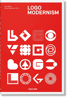
For my logo design, I try to find the pdf of "Logo Modernism" online
This book really helps me to know what kind of logos professionals have done. And also there is a lot of mix n match of graphics that can form into a letter.


Comments
Post a Comment